INTRODUCTION
Already read this? Click here to jump to the latest update!
Figured it would be fun (and wise) to log my progress my learning as I slowly build a piece of a world that has been festering in the crevices of my imagination for years now. In general, I'm going to avoid talking about the story too much to avoid spoilers, and also since I'm still writing it as I work on the game itself. Therefore this blog is mainly going to be about me learning the ins and outs of creating a game from the ground up. This is my first time using Godot and my first time making a game in general, sans the shit I made in Scratch when I was 12. As I'm completely new to all this, I imagine I'm going to also make a lot of mistakes or stupid design decisions, so;
Without giving too much away to the story I'll try to establish the general theme, styling, and inspirations for this project; Design 1-bit dithering!!!
I wanted to create something akin to exploring a 3d version of this site, black and white 1-bit dithering with lots of heavy border lines for contrast. To start with the design I made a couple mockup moodboardy videos in After Effects to capture how this aesthetic would look in motion;
The second video I made had me exploring an offshoot of the story a bit in a code/conlang that will end up being pretty prevelant throughout the game ;). A script that the more venturous of you may have already noticed scattered around this website. If you managed to crack it you should reach out and tell me how you figured it out - im curious how well I did putting this all together.
The music choice for both of these videos was very purposeful too, I want to capture a very ethereal, sacred theme. I expanded on the music choice through a couple playlists to serve as placeholder music until we can make something original.

On top of this, I want other aspects of the games design to be very retro, i'm going to use billboarded sprites for a good ol' boomer-shooter vibe and have a UI designed like an evil original Macintosh. This is the same UI design idea that went into the windows on my new 404 page
Inspiration Naturally this aesthetic led me to explore The Return of the Obra Dinn as it's one of the most prominent examples of pushing a 1-bit dither effect into the realm of 3D. However, my taste in games and media in general is much more surreal, and I want the world of this game to reflect that. Below are some of the inspirational pieces of media and their aspect I hope to capture;
Disillusion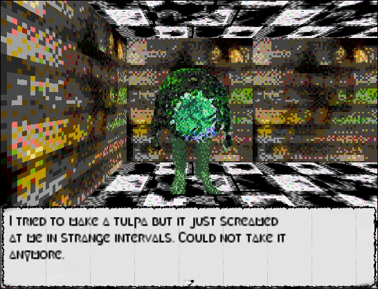
Myst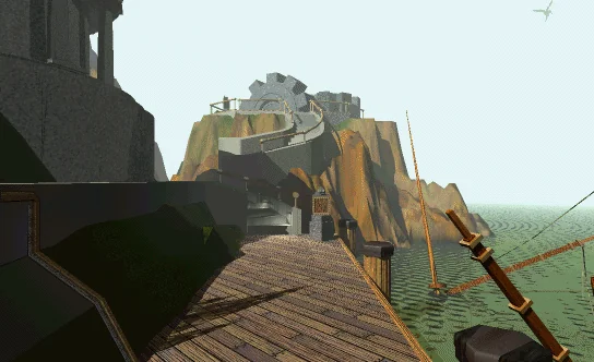
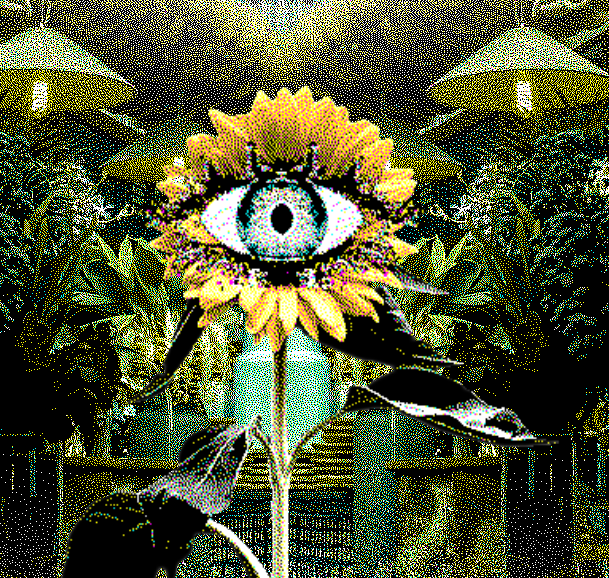 Corru.observer
Corru is a browser game about jacking your brain into an alien biocomputer. It has everything I've already mentioned, dithered graphics, beautiful music and surreal yet often funny dialogue. However, one thing that this game does better than the two above is its worldbuilding and characters. Every aspect of this game is immersive and reflects the larger world that it takes place in, there are little popups about translations from alien languages, errors unique to the "mindspike" interface you use and more - I adore the level of detail. Additionally, despite being "aliens"?? the characters feel extremely fleshed out and memorable. I love this game and you should all play it right now.
Yume Nikki
Yume Nikki needs no introduction. The main aspect of Yume Nikki I want to take with me into designing this game is of it's surreal worlds that work to tell the story, I want the environment to be as much a part of the story as the dialogue and design. The Universe/Theme From the components I pointed out from my inspiration it may be easy to piece together the general world I am trying to make.
Daemonveil places the player into an alternate version of the internet, one built using the realm of spirits, angels and daemons as the tunnel for communications. I want to explore what such a realm would look like if you were to be sucked into it, an amalgamation of technology and spirituality. Would such a technology respark a divine war? What happens when we use our metallic alchemy to get closer to the Gods previously imperceivable? I want the environments of this world to reflect the symbols we assign to beings beyond our understanding and how we comprehend phenomena beyond our control. Gameplay Right now I want to focus mainly on exploration and short Myst-like puzzles, but thats extremely up in the air for the moment. My main focus is to explore and develop this world through surreal environments, characters and dialogue.
Im working on a game.
The Boring Basics- Engine: Godot
- Working Title: Daemonveil
- Genre: Exploration (as of rn)
- Start Date: 12/11/23
- + Typical disclaimer slop that everything I talk about here may not reflect the final product or whatever
Figured it would be fun (and wise) to log my progress my learning as I slowly build a piece of a world that has been festering in the crevices of my imagination for years now. In general, I'm going to avoid talking about the story too much to avoid spoilers, and also since I'm still writing it as I work on the game itself. Therefore this blog is mainly going to be about me learning the ins and outs of creating a game from the ground up. This is my first time using Godot and my first time making a game in general, sans the shit I made in Scratch when I was 12. As I'm completely new to all this, I imagine I'm going to also make a lot of mistakes or stupid design decisions, so;
- Don't take this as an introduction to Godot or anything, I have no idea what the hell im doing
- If you do know what you're doing and are screaming at me through your screen, please feel free to reach out and call me a moron before I continue with a bad idea :)
- (my discord is @omnidisplay)
Without giving too much away to the story I'll try to establish the general theme, styling, and inspirations for this project; Design 1-bit dithering!!!
I wanted to create something akin to exploring a 3d version of this site, black and white 1-bit dithering with lots of heavy border lines for contrast. To start with the design I made a couple mockup moodboardy videos in After Effects to capture how this aesthetic would look in motion;
The second video I made had me exploring an offshoot of the story a bit in a code/conlang that will end up being pretty prevelant throughout the game ;). A script that the more venturous of you may have already noticed scattered around this website. If you managed to crack it you should reach out and tell me how you figured it out - im curious how well I did putting this all together.
The music choice for both of these videos was very purposeful too, I want to capture a very ethereal, sacred theme. I expanded on the music choice through a couple playlists to serve as placeholder music until we can make something original.

On top of this, I want other aspects of the games design to be very retro, i'm going to use billboarded sprites for a good ol' boomer-shooter vibe and have a UI designed like an evil original Macintosh. This is the same UI design idea that went into the windows on my new 404 page
Inspiration Naturally this aesthetic led me to explore The Return of the Obra Dinn as it's one of the most prominent examples of pushing a 1-bit dither effect into the realm of 3D. However, my taste in games and media in general is much more surreal, and I want the world of this game to reflect that. Below are some of the inspirational pieces of media and their aspect I hope to capture;
Disillusion

While the gameplay itself isn't anything revolutionary, I immediately fell in love with the music and aesthetic of this game. The main story of this world revolves around a lot of traditional Buddhist and Hindu stories while creating it's own unique world and lore. The main aspect of this game that I enjoyed and hope to take inspiration from is its mixing of both ethereal thought and surreal-whimsy. Many of the characters say hilarious one-liners or stuff that can geniunely be thought-provoking. While I think I'll take my world a bit more seriously, I do want to capture some of the whimsical surreality that brought me so much joy from this game.
A first-person dungeon crawling RPG with turn-based combat and an emphasis on interacting with the characters around you. Heavily inspired by other games such as LSD dream emulator, eastern mind lost souls, amongst others. Appear with no memory in a land surrounding a bizarre tower drawing in all life with a strange urge to climb it. Climb the tower to gain an understanding of why you are here, the higher you go, the more you may understand. Branching paths and dialog can lead to different outcomes or uncover new areas to explore.
Myst

In all honestly I never finished Myst, but its surreal pre-rendered environments with that classic 90s dither is an instantly recognizable vibe. I could have put any late 90s point and click adventure/puzzle game with pre-rendered graphics but Myst is the only one I physically own and played when I was young so it feels appropriate.
Enter a world where nothing is as it seems... and adventure knows no bounds! Journey to an island world eerily tinged with mystery... where every rock, every scrap of paper, every fleeting sound holds a clue to an ancient mystery. Enter, if you dare, a starkly beautiful landscape shrouded in intrigue and injustice. Only your wits and imagination hold the power to unlock the shocking betrayal of ages past!
 Corru.observer
Corru is a browser game about jacking your brain into an alien biocomputer. It has everything I've already mentioned, dithered graphics, beautiful music and surreal yet often funny dialogue. However, one thing that this game does better than the two above is its worldbuilding and characters. Every aspect of this game is immersive and reflects the larger world that it takes place in, there are little popups about translations from alien languages, errors unique to the "mindspike" interface you use and more - I adore the level of detail. Additionally, despite being "aliens"?? the characters feel extremely fleshed out and memorable. I love this game and you should all play it right now.
Yume Nikki
Yume Nikki needs no introduction. The main aspect of Yume Nikki I want to take with me into designing this game is of it's surreal worlds that work to tell the story, I want the environment to be as much a part of the story as the dialogue and design. The Universe/Theme From the components I pointed out from my inspiration it may be easy to piece together the general world I am trying to make.
Daemonveil places the player into an alternate version of the internet, one built using the realm of spirits, angels and daemons as the tunnel for communications. I want to explore what such a realm would look like if you were to be sucked into it, an amalgamation of technology and spirituality. Would such a technology respark a divine war? What happens when we use our metallic alchemy to get closer to the Gods previously imperceivable? I want the environments of this world to reflect the symbols we assign to beings beyond our understanding and how we comprehend phenomena beyond our control. Gameplay Right now I want to focus mainly on exploration and short Myst-like puzzles, but thats extremely up in the air for the moment. My main focus is to explore and develop this world through surreal environments, characters and dialogue.

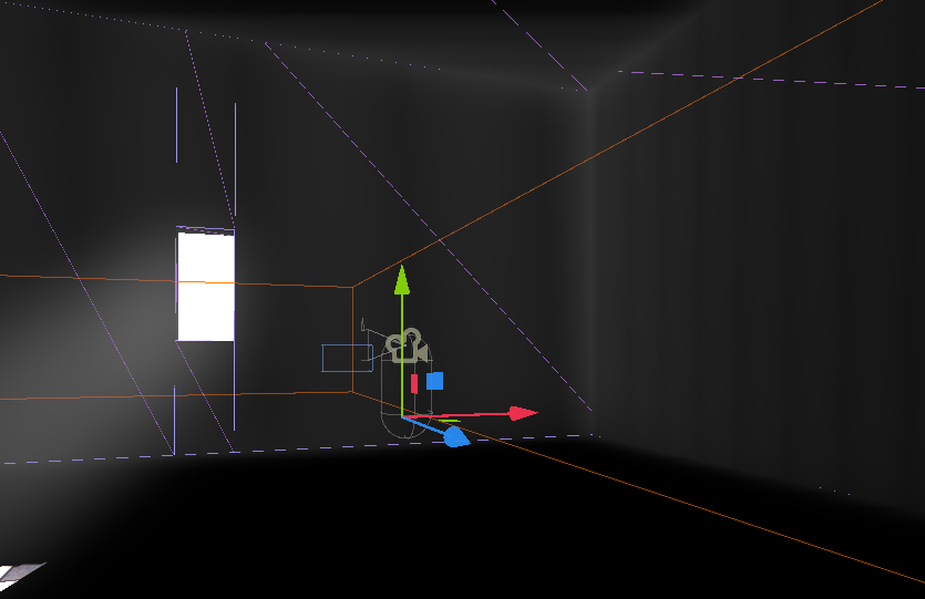
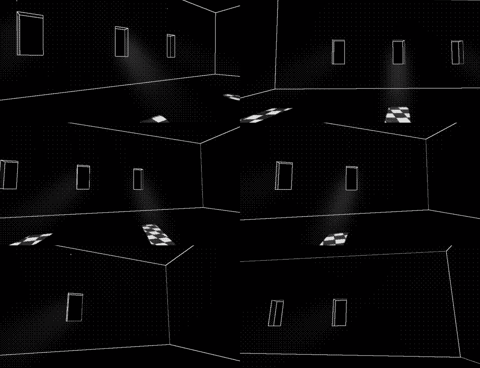
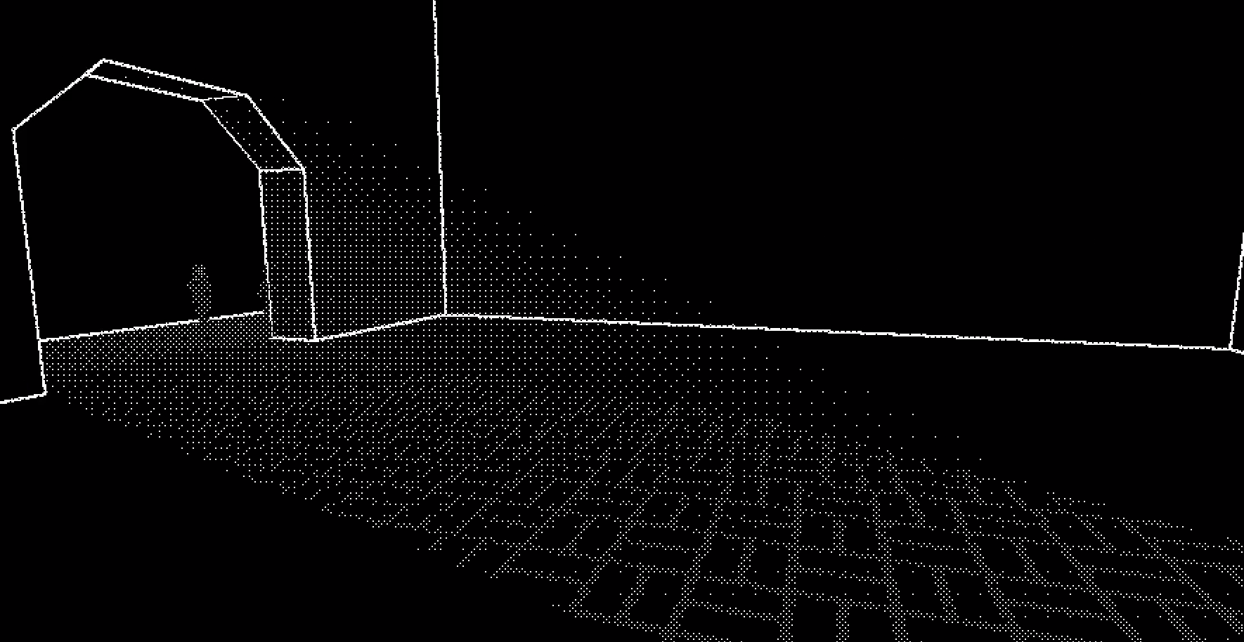 I initially got the idea after messing around with the WorldEnviorment settings on a different map, I realized that enabling VolumetricFog with the directional light I already had
created a cool light effect that paired well with the dithering (rightside image).
From this, I was inspired to test how this effect would look as a way to illuminate a building through windows with cool light streaks and a godray/dusty-air effect.

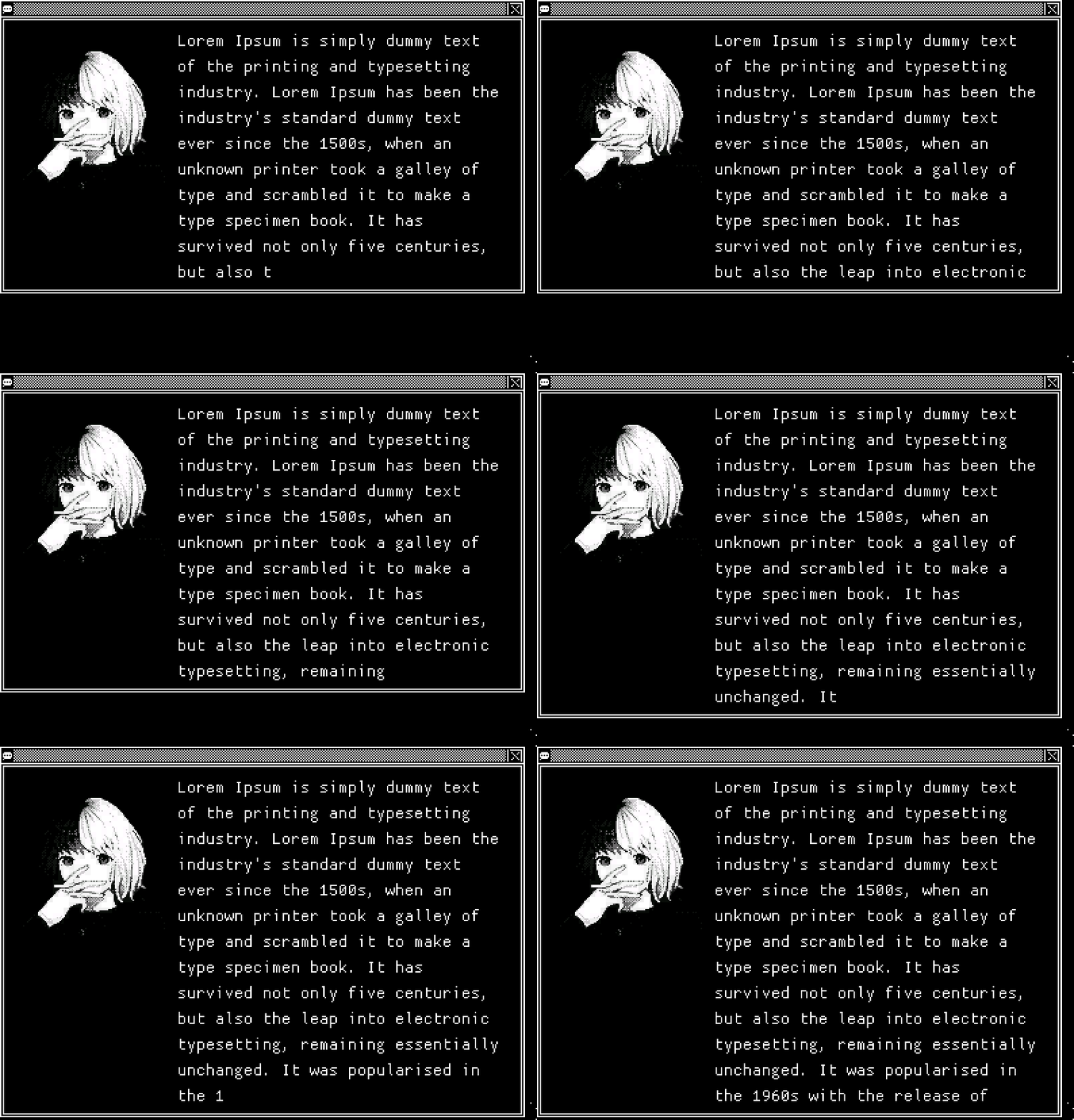 You have to essentially plop the text in the textbox prematurely, wait for it to resize and then grab that size to use for text-wrapping. However, the x and y resize events are seperate, meaning you have to await twice - but for text short enough to not cause any
y displacement that additional resize signal never comes and the textbox initialization hangs. At the moment I don't know a nice solution to this, so the textbox nicely presizes horizontally but not vertically. Luckily this is just
a cosmetic issue, the box expands live if the text lines go higher than the profile picture. Not the end of the world and another little thing to come back to.
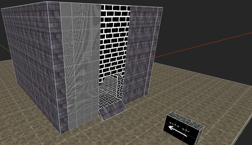
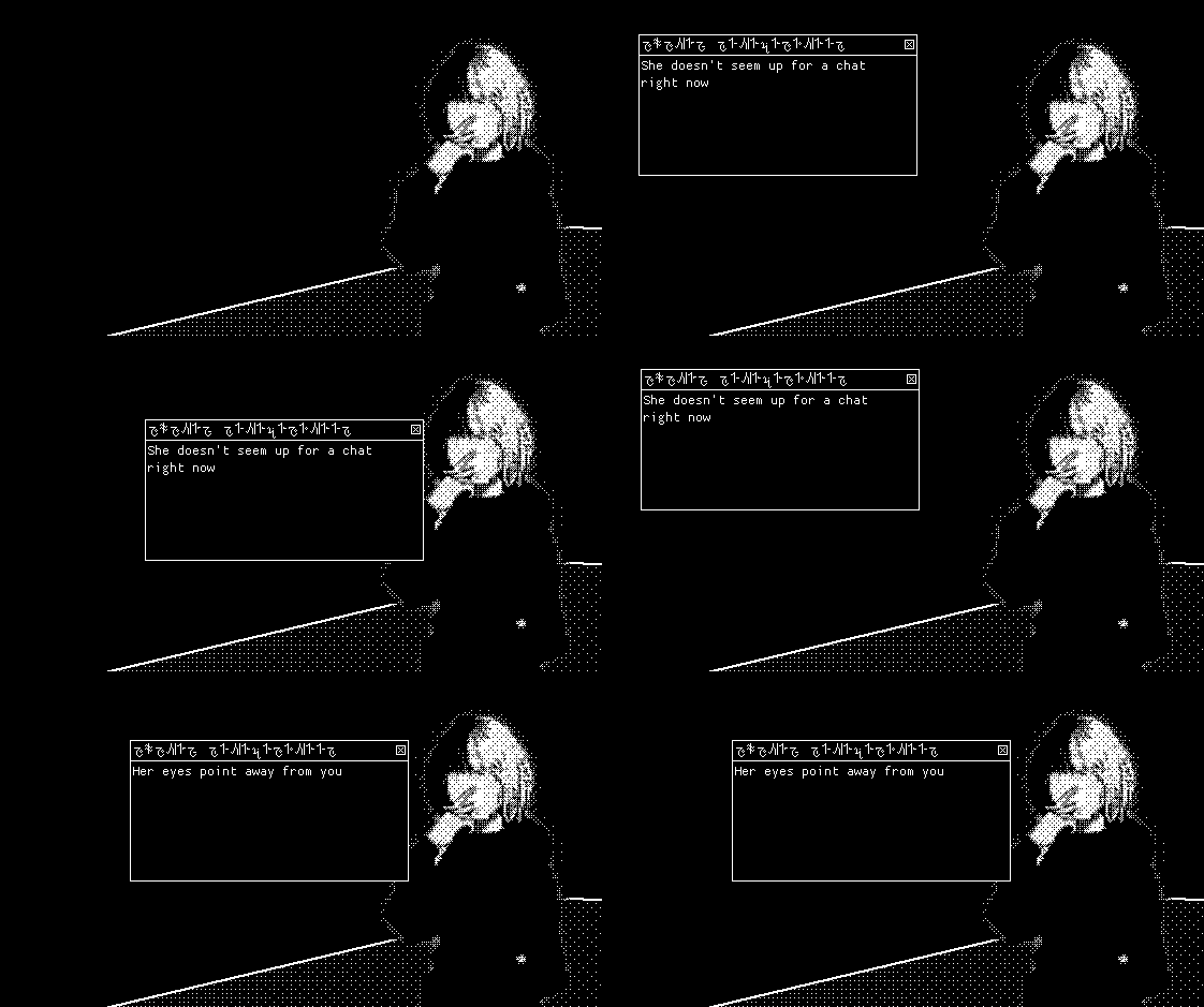 So far I've implemented a basic interaction system and a "dumb npc", one that just triggers a single one-liner response popup rather than a full dialogue-system. The plan for the future is that NPCs that have complex dialogue will summon a new 2d interface for going through dialogue choices. I want this complex
dialogue system to have nice animations and a seperate UI, so it made sense for the "decorative" NPCs to just have a little textbox that doesn't fully disrupt the flow of gameplay.